- Home
- OVPEO
- Public Information and Communication
- University Branding
Caraga State University
BRAND GUIDELINES
Comprehensive standards for using the university’s visual and verbal identity—ensuring consistency across academic, administrative, and promotional materials.
The University Seal
The CARAGA STATE UNIVERSITY seal takes the form of the Philippine National Boat [Balangay].
Below are the representations of the seal:

The torch at the bow of “Doon” represents vision and eagerness, guiding the university’s way forward with clarity, purpose, and drive toward uncharted waters.

The sail, depicted as light rays, represents the university’s stakeholders and clients whose trust and support propel “Doon” forward toward shared success.

The roof represents the university’s Vision and Mission, uniting all efforts under a clear framework that safeguards its core values and goals.

The curve strips represent the university’s interconnected roles in instruction, research, extension, and production that shape its structure and purpose.

The gear represents a continuous drive for innovation and collaboration in pursuing knowledge, technology, and real-world solutions.

The open book represents the university’s dedication to learning, growth, and sharing wisdom across generations.

The map of the Caraga region represents the university’s mission roots in nurturing problem-solvers and value-creators dedicated to building a sustainable future.

The molecular model represents research-based approaches grounded in scientific inquiry, evidence, and analytical methods.

The laurel represents the university’s Core Values: Competence, Service, and Uprightness.
The year 1946 marks the establishment of the Agusan Agricultural High School (AAHS), signifying the institution’s humble beginnings and longstanding legacy as the foundation from which the present-day university has grown and evolved.


Color Pallete
The official colors of the university are depicted in the university seal.
Brand Logo
The CSU logo comprises the CSU seal and its wordmark. There are two versions of the CSU logo.

The single-line wordmark is used in document headers and other legal documents, i.e.
Transcript, Records, Annual Reports, Terminal Reports, Manuscripts, Books, Manuals, and the like.

The two-line wordmark is used for event backdrops, brochures, posters, Certificates/Diploma, banners, programs, and the like
Incorrect Usage of the Seal and Logo
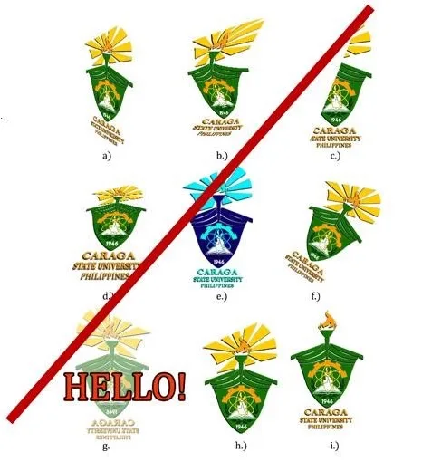
The CSU Seal and logo is the key element of its visual identity. Maintaining its integrity requires consistency in its face value. No one is allowed to make any alterations to the CSU seal. Some of the seal alterations that are not allowed are presented at the right:
a.) Skewing,
b.) Warping,
c.) cropping,
d.) change of perspective,
e.) change of color,
f.) rotation,
g.) ghosting or overlaying,
h-i.) removal of some elements
For the CSU logo, changing the wordmark text
style, size, and arrangement is not allowed.
